Share This Post:
Are you always looking for ways to increase engagement in your social studies classroom? Honestly, so many teachers are!
Students often do not realize how much the past impacts the present. Thankfully, that will change when using charts and graphs in social studies. These are such a powerful tool that brings learning alive for students! They even help simplify complex information and help students develop critical thinking skills. Honestly, charts and graphs are an incredible way to excite, engage, and enrich the learning of all students!
Why Use Charts, Tables, and Graphs?
Social studies deals with so many big concepts. For instance, students learn about population growth, election results, economic trends, and migration patterns. This is a lot to absorb from any textbook lesson or lecture, no matter the age of students.
Luckily, this is where using charts and graphs in social studies comes into play! They break down complex information into visual formats that are easier for students to understand and analyze.
Additionally, charts and graphs allow students to make connections they might not have made otherwise. Since visual aids are all over society, this is an essential way to build a connection with students.
Types of Visuals to Use
When using charts and graphs in social studies, the options are endless!
- Bar Graphs: These are great for comparing categories or changes over time, like voting patterns or census data.
- Line Graphs: These are perfect for tracking trends, like economic growth over the years or climate changes.
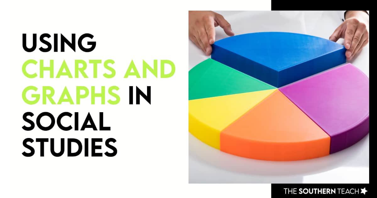
- Pie Charts: Use these to show proportions, like how different sectors of the economy contribute to GDP.
- Tables: Tables help present organized data that students can sort and compare easily, like timelines of historical events or demographic statistics.
- Maps with Data Layers: Maps displaying population density, trade routes, or migration patterns are an excellent way to visually connect geography with historical events.


How to Integrate Charts and Graphs into Lessons
There are so many options when using charts and graphs in social studies. However, start simple to avoid overwhelming yourself and your students. For example, begin with a basic chart highlighting one or two key ideas. As students become more comfortable, you can layer in more complexity.
Students can even make visuals! Provide them with the data and have them create their own charts and graphs. This reinforces the skill of interpreting and analyzing data and makes the lesson more interactive.
It is also helpful to use Current Events. Teachers can tie in recent events like election data, environmental statistics, or economic trends. These are great ways to make the lessons more relevant to your students’ lives.
Interactive tools are also a perfect way to start. If your classroom has access to technology, tools like Google Sheets or online graphing tools are great! They can help students create and manipulate data visually in real time.
Activities and Assessment Ideas
Students love working on projects. So, it is beneficial to tie them in when using charts and graphs in social studies. Luckily, there are tons of options!
- Data Analysis Projects: Have students analyze historical data sets and create a series of graphs to explain the patterns they see.
- Timeline Tables: Use tables to organize historical events chronologically and allow students to add important details such as key players and locations.
- Compare and Contrast Graphs: Present two graphs on the same topic, such as economic growth vs. population growth. Then, ask students to compare and contrast them.
- Interactive Maps: Use maps that allow students to layer different data, such as population density, trade routes, or historical landmarks. This is a great way to show how geography impacts historical events.
The End Game – Why it will benefit students in the long run.
Beyond just decoding numbers, working with charts, tables, and graphs helps students develop visual literacy. This skill is critical in our information-saturated world, where data visualizations are everywhere. Teaching students how to interpret and question the data they see will serve them not just in your classroom but in life.
Using charts and graphs in social studies isn’t just about making your lessons more engaging. It’s about giving your students the tools to analyze and understand the world around them. These visuals make complex information more accessible and help students connect historical events, trends, and patterns in new ways. Thankfully, there are many ways to bring charts and graphs alive in the classroom!
kirsten hammond
Kirsten is a former 3rd and 5th grade teacher who loves helping upper elementary teachers by creating resources and sharing ideas that are engaging, research-based, and TEKS-aligned. She is a work-from-home mama of 3 rambunctious little ones and loves running, true crime, and lots of coffee.


